As Design Manager in the Vendor Portal team, I focused on building UX foundations from the ground up — not by redesigning screens, but by creating the conditions that enable good design.
When I joined, my first task was to understand why a product used by hundreds of thousands of restaurant partners felt so fragmented — as if it had been built by five different companies. In many ways, it had.
This wasn't just a larger team or a more complex product than what I was used to. It was a product without a centre of gravity, within an organisation moving so fast it hadn't paused to notice.
That was the context I stepped into. And what I needed to build wasn't a design — it was the foundation that makes good design possible.
What I walked into
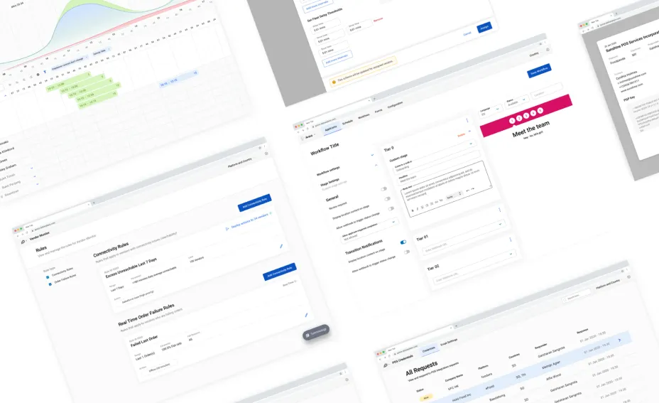
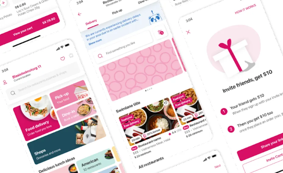
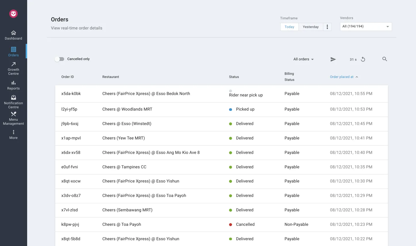
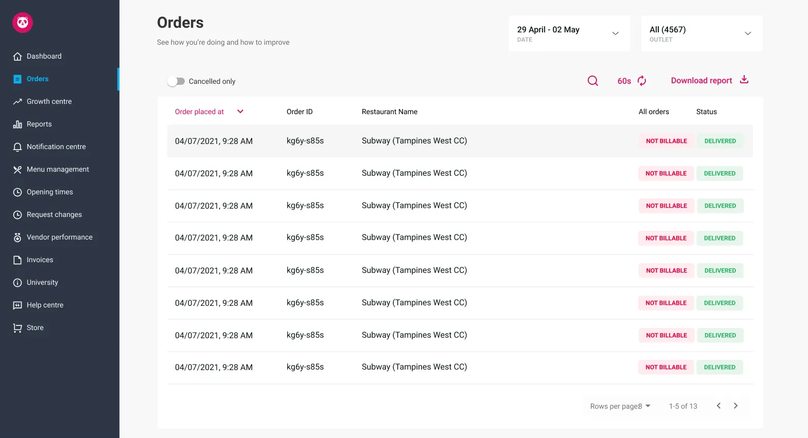
The Vendor Portal is the product restaurant partners use to manage their presence on the platform — menus, opening hours, promotions, payouts, performance data. It's a critical part of the business. When partners can't update their menu or understand their payouts, they call support — and support was overwhelmed.
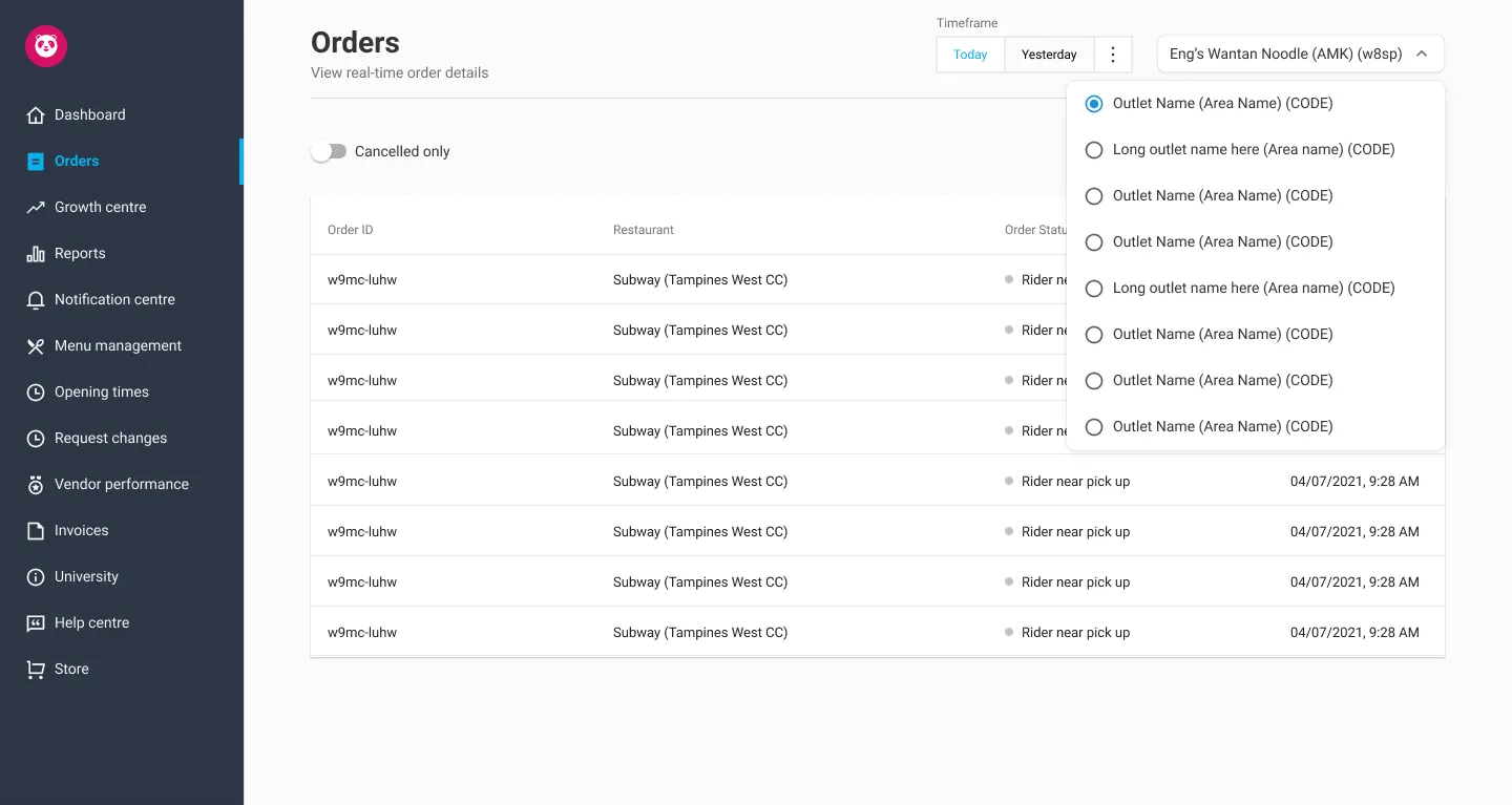
When I joined, the product lacked a shared design direction. Navigation was confusing; partners often felt lost almost immediately. The same features appeared in different forms across the product. The information architecture had grown organically — each team adding what they needed, where they needed it, without a clear view of how it all fit together.
The visual language was inconsistent. Component patterns varied. There was no design system — not even a consistent grid.
And there was no design team. Just one designer — and me.
Building the team while diagnosing the problem
The hardest part of those first few months was doing two things at once: recruiting and diagnosing. I needed to understand what was broken well enough to hire designers who could help fix it — while also being one of just two designers on the team. That meant getting pulled into day-to-day product work, while trying to hold a more strategic perspective at the same time.
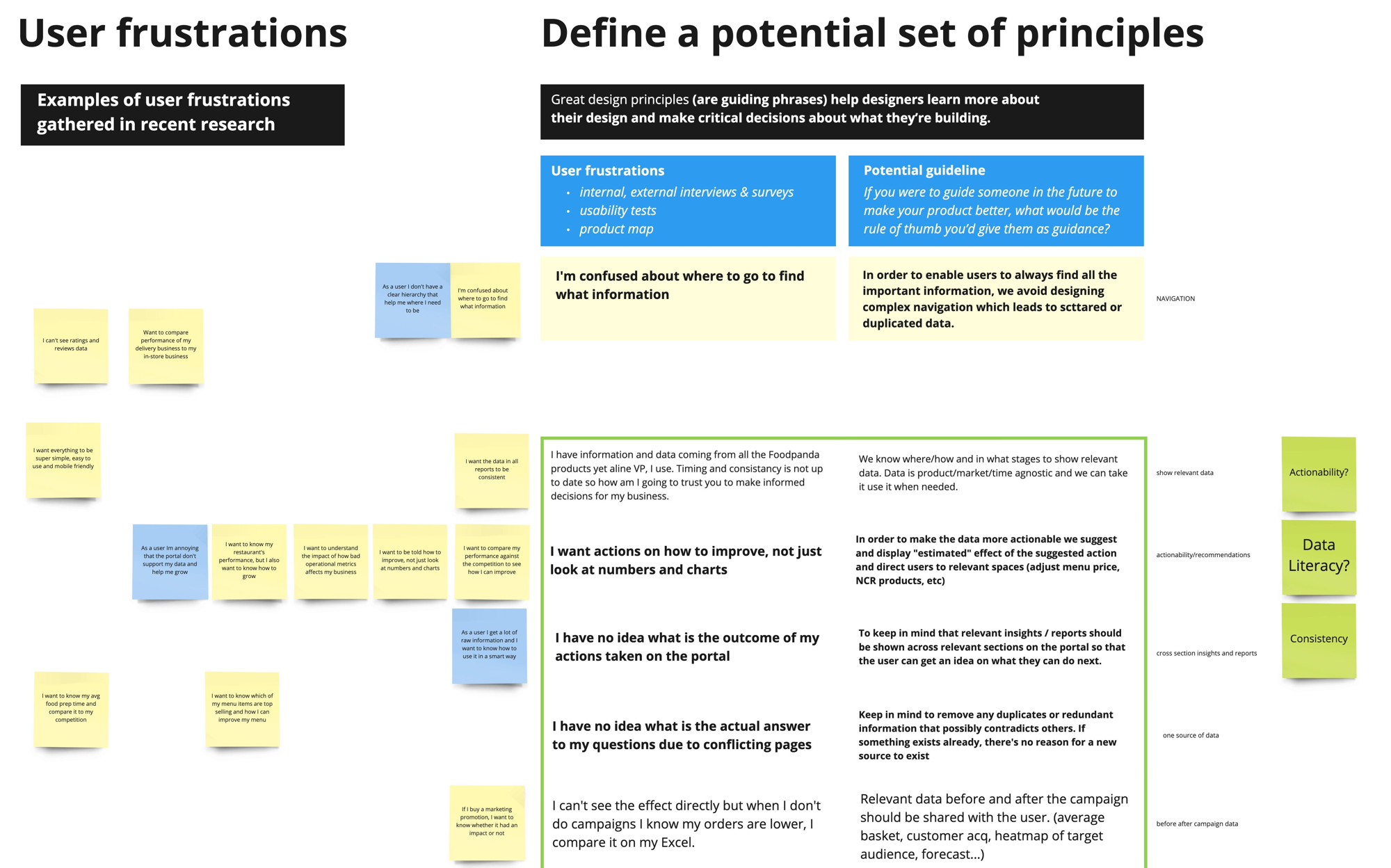
In parallel, we began discovery work. Not formal research at first — just listening. Conversations with operations teams who worked closely with partners every day. Patterns emerged quickly, even before I ran a single usability test.
Partners said things like: "I'm confused about where to go to find the information I need."
They were asking for simplicity. For data that actually meant something — not just numbers on a screen. They were using the product to run their businesses, and every minute spent confused or frustrated was a minute not spent serving customers.
The discovery work, done properly
As the team started to take shape, I introduced a more structured discovery process. It was a cross-functional effort — product, engineering, operations, support, and design — all looking at the same evidence, together.
We mapped the full partner journey through the portal. We identified where users were dropping off and cross-referenced those points with support tickets and operational data. From that, we defined a set of critical UX problems — not a wishlist, but a prioritised list grounded in evidence.
The key issues were clear:
- Navigation that actively misled users about where things lived
- Inconsistent UI patterns, so nothing learned in one part of the product carried over to another
- An information architecture shaped by internal structures, not how partners actually run their businesses
- Too many steps to complete routine tasks
- A mobile experience that had been deprioritised for far too long
Turning evidence into principles
One of the things I wanted to avoid was a situation where we fixed the specific problems we'd found and then created new ones six months later because we still didn't have shared criteria for what "good" meant.
So alongside the tactical work, I worked with the team to articulate design principles for the Vendor Portal. Not abstract values — specific, opinionated statements that could guide decisions.
We landed on six:
Know your audience. Restaurant partners are not tech-savvy users exploring a product for fun. They're business owners under time pressure. Every decision should account for that.
Insights over raw data. Data without context isn't useful. The portal should help partners understand what their data means, not just present it.
Design for habit. This is a product used repeatedly, often for the same tasks. Prioritise efficiency and recognition over exploration.
Respect the user's time. Fewer clicks, fewer decisions, fewer moments of doubt — that's the goal.
Support from the first moment. Onboarding should feel like guidance, not a test. The product should work with the user, not against them.
Aim for better. Not perfect — better. Continuously, incrementally, and with intent.
Exploring alternative directions
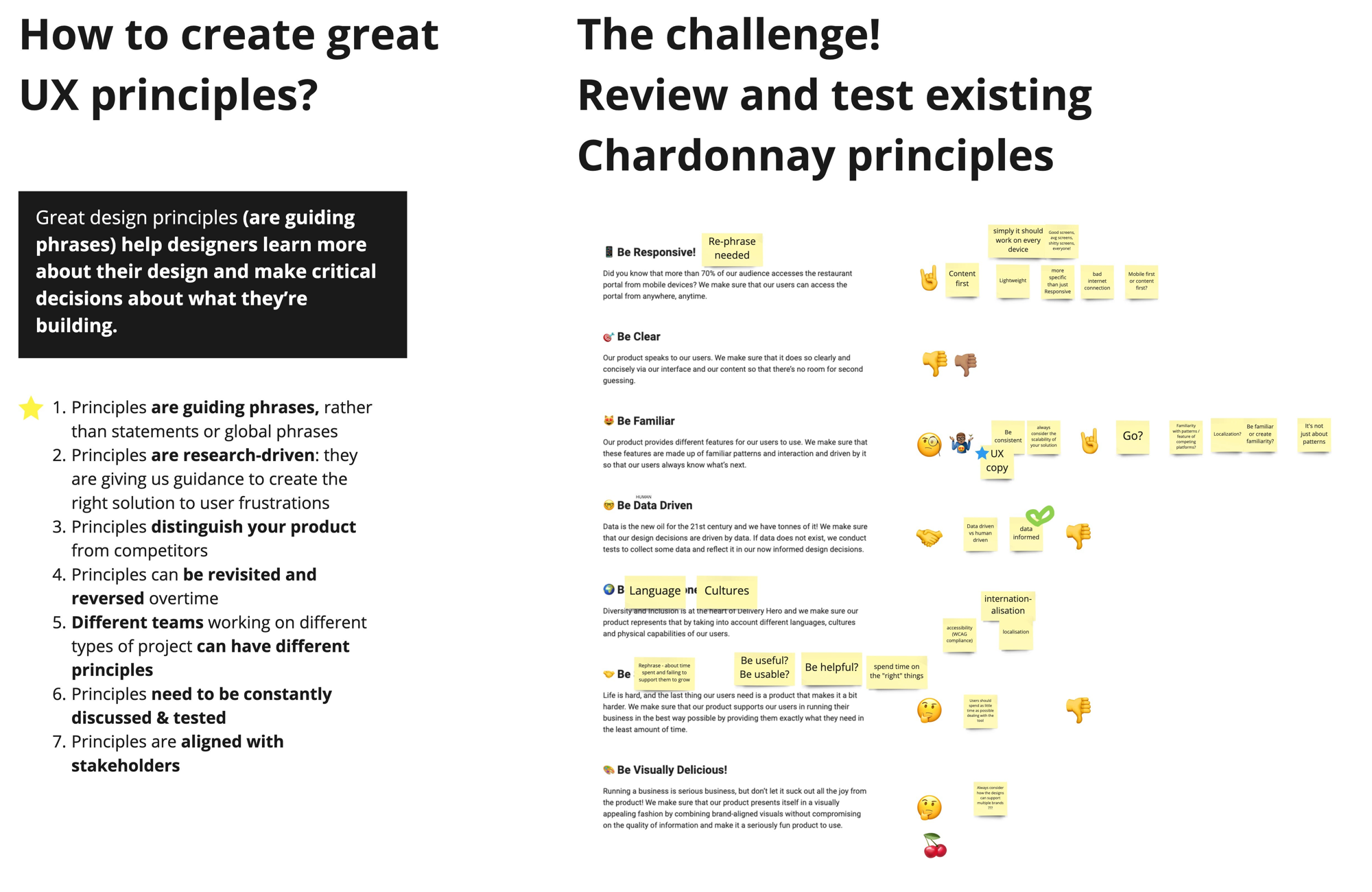
Before we could implement anything, we had to make a decision with real political weight: which design system to build on.
We weren't starting from zero. Delivery Hero already had systems in place, built by other teams. The obvious question was whether we should adopt one of them, rather than carve out our own path. Two options were seriously considered.
Armor had been built for internal applications. Bento was designed for consumer-facing products. Both were mature, came with ready-to-use component libraries, and had dedicated teams behind them.
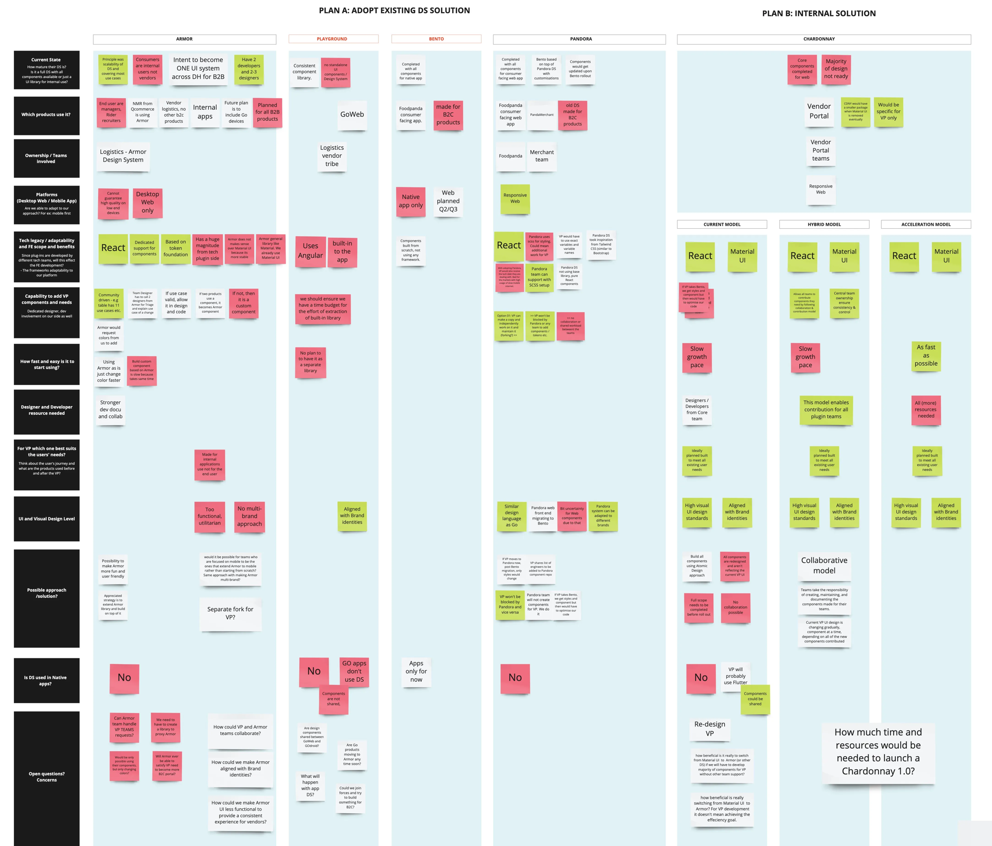
But the deeper we looked, the clearer the trade-offs became.
Adopting either system would mean tying our priorities to someone else's roadmap. Any Vendor Portal–specific needs — and there were many, given that our users were running businesses, not casually browsing — would have to be negotiated. We'd be dependent on another team's capacity, decisions, and direction.
That's a significant risk. We could find ourselves constrained by a system that couldn't fully support our needs — after already committing to it.
There was also a question of fit. Neither Armor nor Bento had been designed for the complexity of the Vendor Portal. We would have needed to build so many custom components that the value of adopting an existing system would quickly erode.
So we made the call to go our own way — but deliberately.
Instead of starting from scratch and creating a multi-year distraction, we focused on what we could build on top of what already existed.
Implementing the design system
With direction established, the next challenge was scale.
We were a growing team, working across a product with dozens of surfaces, alongside engineering teams with their own conventions and constraints. Design decisions couldn't funnel through me — there wasn't time, and more importantly, that's not how a healthy design organisation operates.
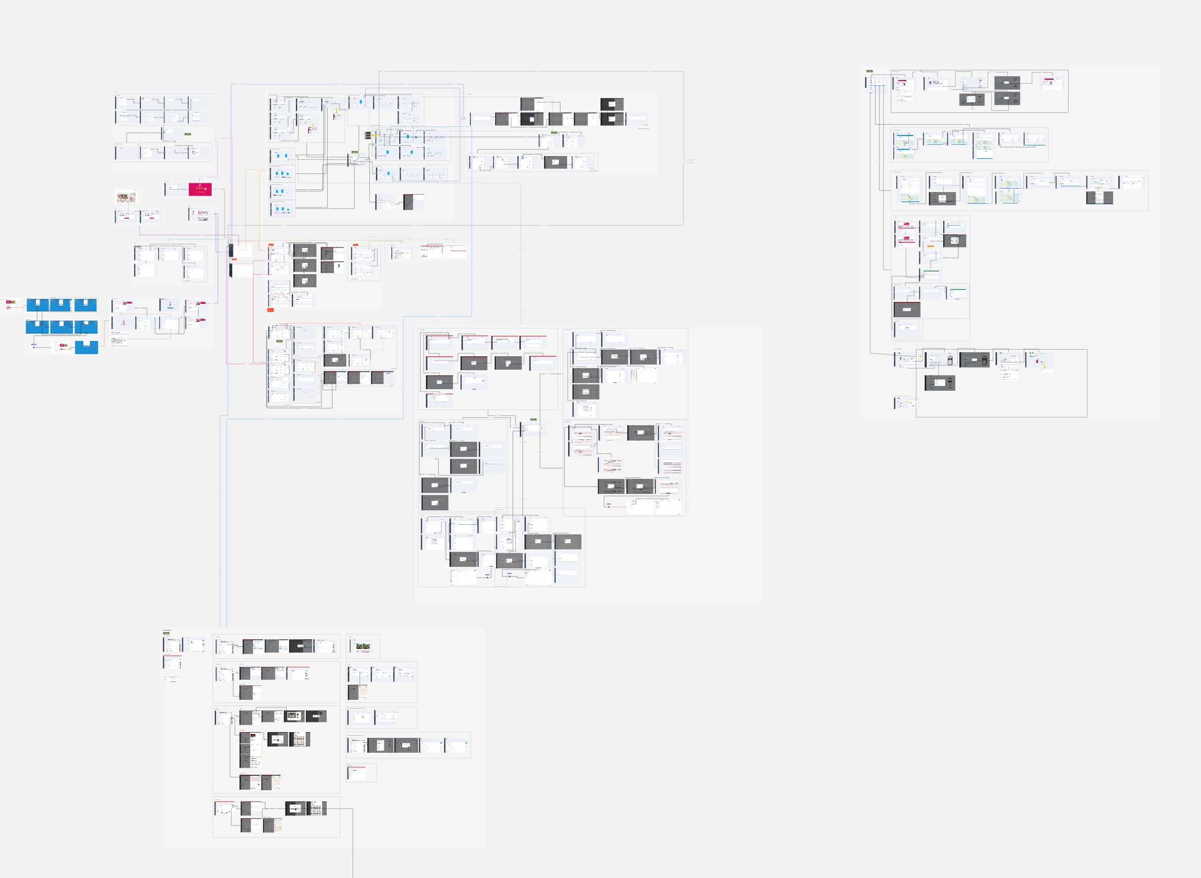
The answer was Chardonnay — the Vendor Portal design system.
Building a system from scratch while the product still needed to ship would have been a multi-year distraction. But we didn't need to start from zero. Most teams were already building on top of Material-UI, an open-source React component library. It wasn't designed for our users, but it was stable, widely adopted, and already embedded in the codebase.
So instead of replacing it, we built on top of it.
Chardonnay evolved as a layer over Material-UI — customised progressively, rather than introduced all at once.
The rollout happened in four phases:
Phase 1 — Introduce core Material-UI components into the Chardonnay library to address the most critical gaps.
Phase 2 — Roll out adoption across teams, replacing custom one-off components wherever possible.
Phase 3 — Chardonnay team updates shared components with custom styling; allow teams to align their domain-specific components accordingly.
Phase 4 — Refine the visual layer: update navigation and background, and introduce localised brand colours across regions.
Four phases. No big bang.
Each phase delivered tangible improvements while quietly strengthening the foundation underneath. The principle I kept coming back to was simple: don't pause product development to achieve design consistency.
Both had to evolve together.
What this actually required of me as a manager
I want to be honest about how challenging this period was.
I was managing a team that was still coming together, working on a product being actively developed by multiple squads — teams that didn't always share our priorities — within a company growing so fast that the organisational structure shifted around us more than once.
There were moments when I had to fight for design to even have a seat at the table. Often, I had to demonstrate value before I could advocate for process — and I had to do both at the same time.
The hardest part was maintaining momentum on long-term, structural work — the design system, the principles, the discovery process — while constant short-term pressure pulled us in other directions. It required ongoing negotiation, and clear, consistent communication upward about why investing in foundations mattered.
Over time, that effort paid off. We moved toward a more mature setup — with design embedded across product squads, supported by shared systems and regular review processes.
What changed
By the end of this work, the Vendor Portal had a shared visual language. It had a design team with clear ways of working, a defined review process, and shared criteria for quality. A design system was in place — so individual decisions no longer had to carry the weight of the entire product.
More importantly, design had shifted from a service function to a core part of product decision-making — shaping direction, not just execution.
Support issues we'd identified decreased. Internally, design reviews moved away from subjective preferences toward grounded, principle-based discussions. New features could be designed within a system, rather than reinvented from scratch.
None of this is visible in a single screen. But it's what makes good screens possible.